
z929669
-
Posts
13,079 -
Joined
-
Last visited
Everything posted by z929669
-

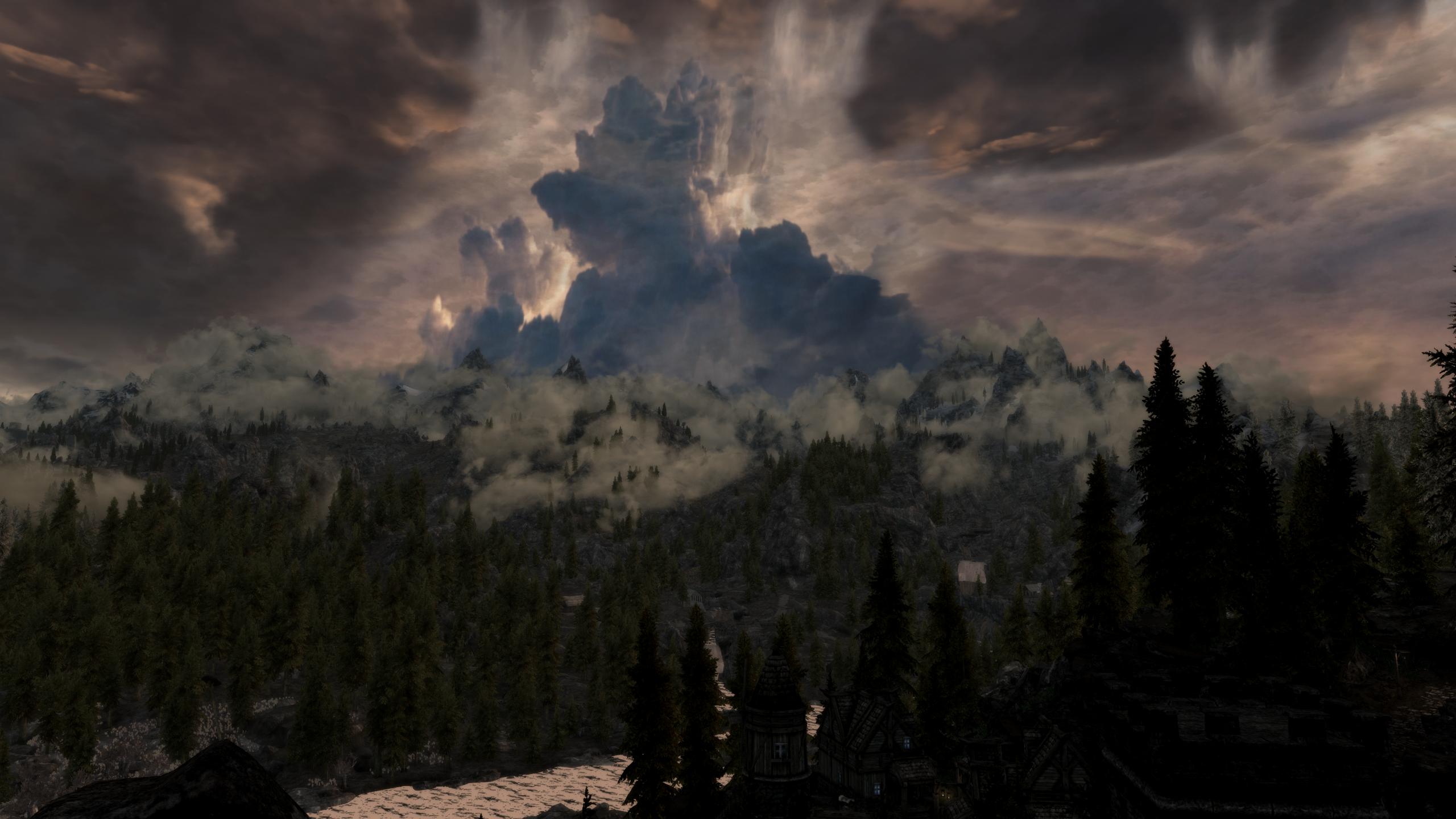
ENB 110 Shadow Comparisons
z929669 replied to stoppingby4now's topic in General Skyrim LE Discussion & Support
It shows that ENB works, that's for sure. Low sucks though with ENB. Med is quite good ... -
Help - Exterior World Space Freezes and CTDs
z929669 replied to MadWizard25's question in General Skyrim LE Support
True enough. Scaling may be closer to exponential than linear. Perhaps add 2 or three before squaring. Or even true exponential... meaning that uGrids 7 should have uExterriorCellBuffer=128 Under this scenario, uGrids 5 wiould have 32 rather than 36, so it could be that as one approaches zero, the expected formula breaks down, hence the added +4. -
DROPPED More Dynamic Shadows and Striping Fixed (by puuloo)
z929669 replied to skwareballz's topic in Skyrim LE Mods
Can anyone corroborate Vond's assessment?? If true (and I have no idea), then it seems that this mod should no longer be a candidate unless/until it is rebuilt to standards. -
Help - Exterior World Space Freezes and CTDs
z929669 replied to MadWizard25's question in General Skyrim LE Support
uGridsToLoad & uExteriorCellBuffer scale together by the formula: uExteriorCellBuffer = (uGridsToLoad + 1)^2 Increasing the latter by a small amount should be OK, but I have never had any problems with the default scaling. -
never tested trifire. Use GPU-z and divide by 3 for VRAM consumption
-
Fri seems to remember these fine details ...
-
Double check the Skyrim Installation Guide and be certain to conform to Fri's advice about installing Steam properly. then revisit the Wrye Bash guide, as the installation instructions changed in the last 24 hours.
-
Are both large textures mods really necessary?
z929669 replied to Spiffyman's question in General Skyrim LE Support
Just install SKYHD first. Vond's approach may be the best: Install SKYHD as your very first texture mod. Then you get whatever you like best with a bit of SKYHD high res shining through where you might otherwise see vanilla (but I prefer vanilla). -
See the DDSopt guide screens. These are well covered testing areas with good reference doc on VRAM in that guide (well over 100 screens, or > 20 per location).
-
Sounds cool, and would only suggest it be converted to muted colors or grayscale. Will likely need to paint on a monochromatic text surface as well.
-
Good Performance Hunting
z929669 replied to Bealdwine's topic in General Skyrim LE Discussion & Support
Still working on final recommendations for DDSopt vanilla -
Love this mod
-
Are both large textures mods really necessary?
z929669 replied to Spiffyman's question in General Skyrim LE Support
Agree with all of the above, and second Vond's opinion about SROHD. Definitely my favorite fo them all. If you want to compare all of the tex pack overhauls in five different worldspaces, visit the tables at the bottom of the DDSopt guide. Well over 100 images with HRDLC, SROHD, SKYHD, SERHD, & ISTPS (plus Vano89) -
Have to say I just love this font and layout. Prefer stone or wood as the background though, and font carved into that surface.
-
SMCO - Skyrim Mods Complex Optimizer? Anyone used this?
z929669 replied to Vond's question in General Skyrim LE Support
Would like to know performance impact of mesh opt (without confounding added by other opt). Anything yet on this? -
Go ahead and update the WBG if you want (& thanks again for writing this up). Suggest that we update the SIG to point to this methodology if the consensus agrees that it is clearer and more efficient to do so.
-
Agree with s4n and would go further to say that Wrye Bash is arguably superior for managing mods than ANY other mod organizer (including MO) PROVE ME WRONG AND WRITE A REVIEW!
-
OK, as Beald and Monty are not weighing in on this one, I am pretty much alone in the whole "let's deliberate" thing :( So open the flood gates if you wish I will do my best to adapt EDIT: Found Beald's post (thanks Fri!). Further confirms SVN ...
-
Good Performance Hunting
z929669 replied to Bealdwine's topic in General Skyrim LE Discussion & Support
This is great to hear Beald Keep your eye on the DDSopt thread ... Hopefully more good info coming your way over the coming weeks ;) -
Screen resolution and VRAM info
z929669 replied to Vond's topic in General Skyrim LE Discussion & Support
@MW For several reasons, I think that this is an overestimation (no offense!). We need to accurately assess VRAM in conjunction with detectable stuttering under controlled conditions before we can say exactly what is necessary. My experiences are simply not consistent with needing any more than a 1.5 (dedicated) Gb VRAM allocation with default STEP using max FPS! versions of mods (but I do not have any hard evidence ... yet ;) ) -
OK, to finalize this, my next step will be to test the DDSopt'ed normal map with/wo the DDSopt'ed color map (there will be four combinations, two of which will be new to me). I do assume that this will affect certain of the 2:1 textures, depending on implementation of those textures, and the prevalence of 12th mipmap usage in mid-distance. (I added this as a bug on the DDSopt bugtracker at Github .. also posted this as a bug on the DDSopt dev forum ... more of a feature request than a bug though maybe)
-
Well done MW, thanks! (still haven't looked, but I am certain it is good ;) )
-
Are the devs telling everyone to download the SVN?? Is 295.5 not still up on the Nexus?They are only supporting 295.5 right now. Otherwise they would release the SVN as a 296 Beta ;) EDIT: Still waiting for Monty and Beald to chime in on this topic, as I suspect our brethren across the pond may be inclined toward deliberation and consistency ... They are telling everyone to download 296 yes. They also tell everyone that they don't supply support for 295.5. And as I said about Nexus, the people that are currently actively working on fixing WB don't have access to upload 296 to Nexus, it's been discussed quite a bit in the WB threads on Beth forums. :) :doh!: Wasn't aware at all (too busy to browse other forums!!). This is bad! What a mass of confusion ... Seems like they need a project manager over there OK, I suppose then that the real question is: do we want to follow the WB-team lead (which is altogether confusing) or forge our own way more deliberatively in the interest of getting novice users successfully set up with STEP and properly maintaining it. Won't it be simpler for these users to graduate to the SVN/Python methodology once they get their feet wet rather than throwing them into the deep end?
-
Are the devs telling everyone to download the SVN?? Is 295.5 not still up on the Nexus? They are only supporting 295.5 right now. Otherwise they would release the SVN as a 296 Beta ;) EDIT: Still waiting for Monty and Beald to chime in on this topic, as I suspect our brethren across the pond may be inclined toward deliberation and consistency ...
-
sorry s4n, I am lost. Can you be more specific? What is DLC2? Only STD vanilla has textures\landscape\trees\treepineforestbranchcomp.dds (HRDLC does not, only the normals... I still have to test the normals BTW) Increase in detail of the DDSopt versions?
